6 Interactive Walkthrough Examples to Simplify Your Onboarding
The quick answer
Quick answer: an interactive walkthrough is an in-app guide that teaches your product by having the user do each step in the real interface (click this, fill that in) instead of watching a video or reading a help article. The good ones are short, start when the user is trying to do the task, and end on a real result such as a first design, page or message. The six examples below (Canva, Notion, Duolingo, Grammarly, Slack and PLG OS) each show a different pattern, and the comparison table after them shows which one to borrow for your product.
If you've ever signed up for a new platform and instantly felt like you knew exactly what to do, chances are, you were guided by a great interactive walkthrough. These smart onboarding aids have changed the game when it comes to introducing users to digital products. Instead of long manuals or static pop-ups, interactive walkthroughs take users on a hands-on journey that teaches by doing.
Interactive walkthroughs are the superhero of onboarding, guiding users through your app or platform in a friendly, engaging, and helpful way. Think of them as a tour guide, but way cooler. They ensure that users don’t just skip through tutorials—they remember what they’ve learned.
Think of it as your product’s friendly tour guide—welcoming new users, holding their hand through the first few clicks, and making sure they don’t get overwhelmed or lost.
Let’s check out the 6 interactive walkthrough examples that can transform your onboarding process from a snooze fest into an exciting, engaging experience for new users. Let’s get started!
Benefits of Interactive Walkthroughs
Interactive walkthroughs outperform traditional customer, employee, and user onboarding techniques in terms of advantages and value, as well as effectiveness and efficiency. Some of the most popular benefits are:
- Personalized, contextual guidance: Walkthroughs can be tailored to an end-user's role, consumer segment, or other user characteristics. As a result, walkthrough-based training programs are goal-oriented and assist users in becoming more proficient at their tasks.
- Faster adoption: Instead of fumbling through help content or exiting the application to ask someone else, new customers and workers can perform a tour. With a tour, they can begin utilizing a new tool on day one, increasing total user adoption.
- Employees can discover a walkthrough to help them navigate a procedure or feature at any time. Walkthroughs are available at any time, providing self-service support whenever your users require assistance.
- Quick multiple-format content creation: You may easily and rapidly develop walkthroughs without any coding experience. Some platforms go further: Whatfix, for example, can export a walkthrough as a video, slideshow or PDF for training material.
Walkthroughs are simply distributed because they reside within your digital tool or program.
- Walkthrough software is typically less expensive than traditional training techniques since it is easier to generate and maintain existing information. Updating a whole video course or producing new content to accommodate a new feature can take many weeks. Updating a walkthrough usually means editing a few steps, which is far quicker.
- Less time spent on support: By providing good self-help solutions using interactive help software, your support team will receive less requests for assistance. People prefer to find what they need on their own rather than wait for a representative and explain the situation.
- Information retention: By taking customers through a product's major features and functioning, interactive walkthroughs can help them remember more of what they have learnt.
- Increased user engagement: Interactive walkthroughs can assist improve the overall user experience by providing a simple and intuitive approach for users to learn about a product or service.
6 Interactive Walkthrough Examples for Better Onboarding
Onboarding flows change often. The descriptions below come from each product's onboarding as we reviewed it, updated in October 2026 wherever the company's own help pages or announcements show something has changed.
1. Canva: Learn by Doing from the First Click
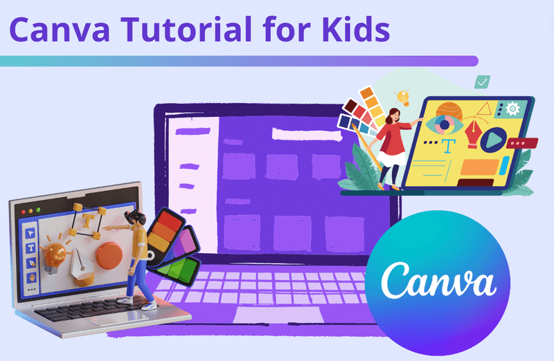
Canva’s onboarding is a masterpiece in simplicity and interactivity. Canva keeps a “What will you be using Canva for?” setting on every profile, and its onboarding starts from designs rather than from documentation: a tailored, interactive design experience.
What’s cool is that instead of explaining how the editor works, it gets you editing a real design straight away, so changing a font or an image is the lesson. It’s immediate, non-intrusive, and effective.
Why it works: Canva blends onboarding with real task completion, so users learn and create simultaneously.
2. Notion: A Walkthrough That Doubles as a Tutorial
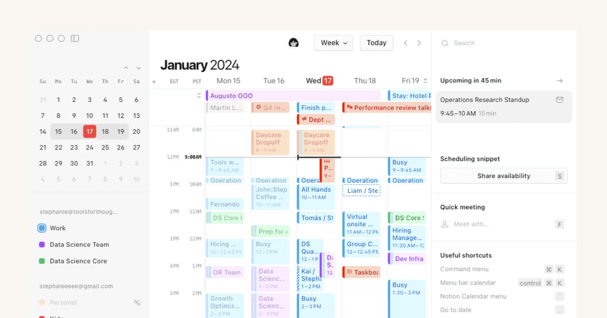
Notion’s onboarding feels like you're exploring a clean workspace with a mentor whispering helpful tips in your ear. New users find a set of starter pages in the sidebar, which Notion says it picks based on what they told it during onboarding, and those pages double as a live tutorial.
This interactive document lets you try out features as you read about them. From typing commands to adding templates, it’s all laid out clearly and intuitively.
Why it works: Users aren’t taken away from the interface—they’re learning in the environment where they’ll actually work.
3. Duolingo: Gamified Onboarding in Action
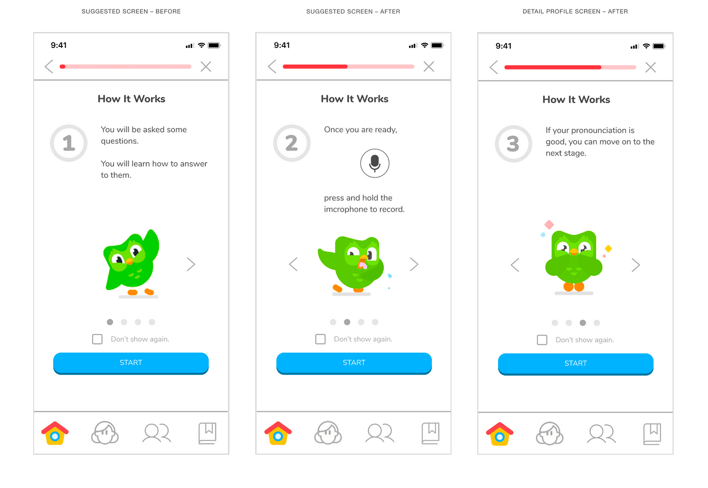
Duolingo is a perfect example of onboarding as motivation. From the start, users pick a language, answer a few questions about their motivation and goals, and can take a placement test to skip ahead. As you go through the walkthrough, you’re immediately involved in activities that feel like games, not lessons.
Each interactive step is bite-sized, rewarding, and gives a sense of progress. There's a streak counter for the days in a row you study. Hearts, which capped how many mistakes a free user could make like game lives, are being replaced for free users by an “energy” pacing system that Duolingo began rolling out in 2025, starting on iOS. Engagement is built into the walkthrough.
Why it works: The gamification keeps users hooked and makes learning feel effortless from day one.
4. Grammarly: Personalized and Progressive Walkthrough
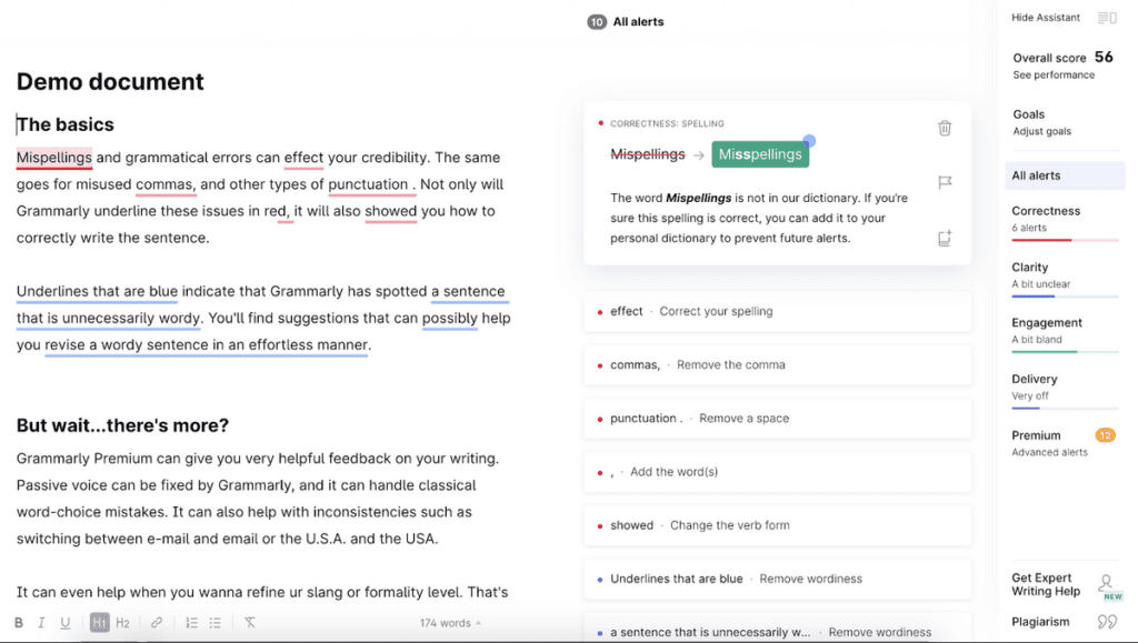
Grammarly’s onboarding is smartly segmented. You can set goals for each document (who the audience is, how formal it should be and, on paid plans, a domain such as academic, business, email or casual), and Grammarly tailors its suggestions to those answers. Grammarly’s parent company renamed itself Superhuman in October 2025; the Grammarly product keeps its name.
Once inside, it provides real-time feedback as you type, so you see how the tool works right away. As you use it, more tips and tools appear gradually, avoiding information overload.
Why it works: The personalized, progressive reveal of features keeps users from getting overwhelmed and adds real value quickly.
5. Slack: Conversational Onboarding (and What Changed)
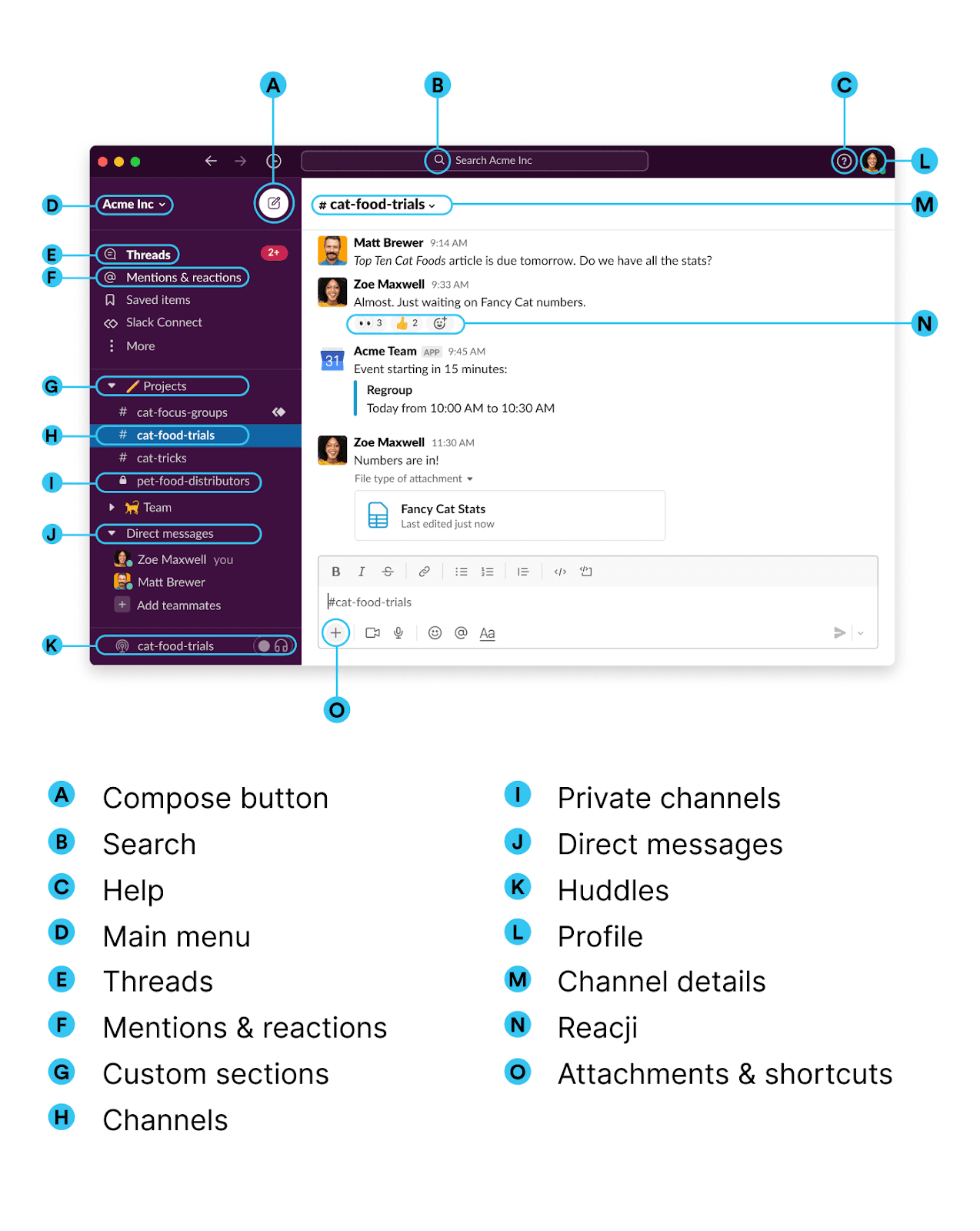
Slack made conversational onboarding famous. When this post was first written, we described “Slackbot” as a friendly assistant that walked new users through setup using a chat interface, instead of bombarding them with feature highlights.
That has changed. Slack’s current getting-started guide has new users fill in their profile, set notifications and start messaging on their own, and since January 2026 Slackbot is an AI agent for work (on Business+ and Enterprise+ plans, with Free and Pro plans limited to trials or previews) rather than a setup guide. The pattern is still worth copying: guidance that arrives as a message inside the product feels like part of it.
Why it works: The walkthrough feels like part of the product rather than a separate tutorial, making the process feel natural.
6. PLG OS: Step-by-Step Onboarding for B2B Teams
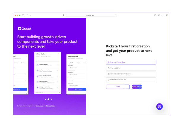
PLG OS is a platform designed to help SaaS companies build and scale product-led growth strategies, and it ships walkthroughs as a component for your own product rather than only using one on itself.
Its Walkthrough component adds step-by-step tours to a website or web app with a couple of lines of code, and the step text can then be changed from the PLG OS dashboard without a release. Walkthrough data is added to the user's profile in PLG OS and can be sent on to your CRM or other tools.
To make the walkthrough adapt to the user, pair it with the onboarding quiz component, which asks new users who they are and what they came for, and run different onboarding flows for different answers.
Around the walkthrough sit embedded onboarding tips, a get-started guide and a quest list checklist, so teams can start building right away, not just learning.
Why it works: PLG OS understands that in a team-based SaaS environment, onboarding isn’t just about individuals—it’s about helping cross-functional teams collaborate efficiently from day one.
The six walkthroughs compared
Each example uses a different pattern. Borrow the one that matches what your new users have to do first.
| Example | Pattern | What the user does | Borrow it if |
|---|---|---|---|
| Canva | Learn inside the real editor | Edits a design from the start | Your product makes something visible |
| Notion | Starter pages that double as a tutorial | Reads and edits pre-filled pages | Your product is a blank canvas |
| Duolingo | Gamified first lesson | Completes short, scored exercises | The habit matters more than the setup |
| Grammarly | Goal-based, progressive feedback | Sets goals, then writes with live suggestions | Value depends on the user’s context |
| Slack | Conversational setup | Completes setup steps prompted by messages | Your product is already a chat or inbox |
| PLG OS | Walkthrough component plus quiz and checklist | Follows steps chosen for their role | Different users need different first steps |
How to build an interactive walkthrough
Pick the first task a new user must finish before your product is useful, and build the walkthrough around that task only. Trigger it when the user starts the task, not on first login, and end it on the finished result rather than on a “You’re all set” screen. Then decide how you will build it: a no-code platform such as Appcues, Userpilot, Pendo or WalkMe (part of SAP since September 2024), or a library in your own code. Among libraries, Driver.js, React Joyride and Reactour are MIT-licensed, while Shepherd.js and Intro.js are AGPL-3.0, so check the licence before shipping either in a closed-source product. Our roundup of the best user onboarding software for SaaS startups compares the platforms and their September 2026 prices.
Two things break walkthroughs in production. The first is the page changing under them: in a single-page app the element a step points at may not exist yet, may never appear or may move, and our SPA tour target recovery specification decides what the tour does in each case. When a release removes a target anyway, the broken-target incident runbook covers detection and containment. The second is accessibility: run the keyboard-accessible product tour acceptance test before launch so keyboard and screen-reader users can finish it too. If different users need different walkthroughs, start with how to personalize onboarding and in-app feedback.
Conclusion: Transforming Onboarding with Interactive Walkthroughs
Interactive walkthroughs aren’t just a nice-to-have—they’re a must-have in today’s competitive market. By making your onboarding process more engaging, fun, and helpful, you’ll not only ensure that users know how to use your product, but you’ll also create a positive first impression that keeps them coming back for more.
From tooltips and checklists to gamified challenges and action-oriented tutorials, there are endless possibilities for creating an onboarding experience that stands out. Whether you're guiding users through a complex task or offering them a friendly, interactive tour, these examples prove that onboarding doesn't have to be boring.
So, what are you waiting for? Take inspiration from these examples and start designing onboarding experiences that wow your users from the very first click. Your retention rates—and your users—will thank you for it. Book a call now!!
FAQs
1. What is an interactive walkthrough?
An interactive walkthrough is a step-by-step, in-app guide that helps new users learn how to use a product by performing key actions directly within the interface. Each step waits for the user to do something real, such as clicking a button or filling a field, before moving on.
2. How is an interactive walkthrough different from a tutorial?
Unlike static tutorials or videos, walkthroughs are hands-on and personalized, allowing users to learn by doing rather than just watching or reading. A product tour that only points at parts of the screen sits in between: it is in-app, but the user is not asked to do anything.
3. Why should I use an interactive walkthrough in my SaaS product?
Walkthroughs reduce user confusion, accelerate product adoption, and improve retention by guiding users to success faster and more intuitively. They work best for the one or two tasks every new user must complete before the product is useful.
4. Can I create interactive walkthroughs without coding?
Yes, tools like Appcues, Userpilot, WalkMe, and Pendo allow product teams to build no-code interactive walkthroughs quickly and easily. A developer installs the snippet or SDK once. If you would rather build in code, Driver.js, React Joyride and Reactour are MIT-licensed, while Shepherd.js and Intro.js are AGPL-3.0, which matters for closed-source products.
5. How long should a walkthrough be?
Keep it short and focused. The best walkthroughs guide users to a quick win in just a few steps, ideally under 5 minutes. If a walkthrough keeps growing, split it and trigger each part when the user reaches that task.