8 Examples of Onboarding Screens to Welcome Users
First impressions are everything. When a user opens your app for the first time, the experience they encounter can make or break their long-term engagement. A thoughtfully designed onboarding process not only helps users understand your app but also builds trust, excitement, and habit-forming engagement. Let’s check out the 8 examples of onboarding screens that make users feel welcomed, informed, and empowered.
What are onboarding screens?
Onboarding screens are the first set of screens that users see when they open an app for the first time. Their main purpose is to introduce the app, guide users through key features, and help them understand the value of using the app. Essentially, they act as a tutorial and a first impression rolled into one.
Key Features of Onboarding Screens:
- Welcome Users: Greet users and create a positive first impression.
- Explain Value: Highlight the main benefits of the app.
- Guide Navigation: Show how to use essential features and get started.
- Collect Preferences: Sometimes ask users for preferences to personalize their experience.
- Encourage Action: Include calls-to-action (CTAs) like “Sign Up” or “Get Started.”
Why Onboarding Screens Are Crucial
Onboarding screens are the gateway to your app experience. Think of them as your app’s first handshake with users. Here’s why they matter:
- Set expectations early: A well-structured onboarding screen explains how your app works and what users can achieve.
- Reduce friction: Guiding users step-by-step prevents confusion and app abandonment.
- Show value immediately: Users are more likely to stay when they quickly understand the app’s benefits.
Studies show that apps with well-designed onboarding experiences can increase user retention by up to 50%. That’s huge considering most users decide within the first few minutes whether they’ll continue using an app.
1. The Classic Feature Tour
The feature tour remains one of the most popular onboarding approaches. It’s a series of slides or screens designed to highlight your app’s core features.
How It Works
- Display 3–5 slides highlighting key features.
- Use concise copy paired with visuals—icons, screenshots, or short animations.
- End with a clear call-to-action (CTA) to start using the app.
Real-Life App Examples
- Slack: Introduces channels, messaging, and notifications in a simple carousel.
- Trello: Shows users how boards, lists, and cards work in just a few screens.
Mockup Suggestion
- Slide 1: “Organize your work effortlessly” with a simple animation of a Kanban board.
- Slide 2: “Collaborate with your team” with a visual of users interacting.
- Slide 3: CTA: “Get Started” or “Sign Up.”
PLG OS Integration
With PLG OS, you can track which features users engage with during onboarding. For example, if a feature tour shows three features but users only interact with one, you can adjust the messaging or layout to highlight the most critical features.
2. Interactive Onboarding Screens
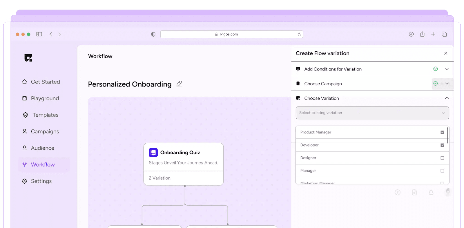
Static slides are informative, but interactive onboarding encourages users to take action from the start. 77% of users say they have deleted an app because of a confusing or overwhelming first-time experience.
How It Works
- Include selection screens like preferences, interests, or goals.
- Allow users to engage with simple interactions instead of passively swiping.
- Integrate micro-animations to make the experience delightful.
Real-Life App Examples
- Duolingo: Users select languages and skill levels before starting.
- Spotify: Users select music preferences to tailor their experience.
Mockup Suggestion
- Step 1: “Choose your interests” with tappable icons.
- Step 2: “Set your preferences” using toggles or sliders.
- Step 3: CTA: “Start Listening” or “Start Learning.”
Why It Works
Interactivity fosters engagement and gives users a sense of ownership. Using PLG OS, you can track which interactions correlate with higher retention, and test variations to optimize the flow.
3. Progressive Onboarding
Not every app needs a full walkthrough upfront. Progressive onboarding introduces features gradually. 65% of users prefer learning app features gradually (progressive onboarding) rather than through a full tutorial upfront.
How It Works
- Provide contextual hints as users navigate.
- Use pop-ups or tooltips instead of full-screen instructions.
- Only show guidance relevant to the current action.
Real-Life App Examples
- Notion: Introduces blocks and pages progressively as users explore.
- Canva: Shows tooltips when users access editing tools for the first time.
Mockup Suggestion
- When the user opens the editor, a small tooltip: “Tap here to add text.”
- After creating a design, another tooltip: “Use the color palette to customize.”
PLG OS Advantage
Track which features users discover independently versus via onboarding. This helps prioritize which elements need more guidance and which can be left to exploration.
4. Social Login & Quick Start
Sometimes onboarding isn’t about education, it’s about speed. Quick start onboarding reduces friction with instant login options. Apps that offer social login options experience a reduction in drop-offs by 20–30% at the registration stage.
How It Works
- Allow sign-up via Google, Facebook, or Apple.
- Skip lengthy forms; ask for additional information later.
- Combine with a minimal welcome message highlighting the app’s value.
Real-Life App Examples
- Instagram: Allows users to quickly sign up and start exploring.
- Slack: Offers single-click login options for teams.
Mockup Suggestion
- Screen 1: “Welcome to [App Name]” with a simple tagline.
- Screen 2: Social login buttons with minimal copy.
- Screen 3 (optional): Short tip: “Connect with friends to get started.”
Why It Works
Fast entry removes barriers. Users feel rewarded by accessing content immediately. With PLG OS, you can track conversion rates for different login methods and optimize the entry point.
5. Personalized Onboarding Screens
Users love feeling seen. Personalized onboarding tailors the app experience to individual preferences.
How It Works
- Ask users questions or use past behavior to curate content.
- Display personalized dashboards or tips.
- Update recommendations dynamically as users engage.
Real-Life App Examples
- Netflix: Suggests shows based on user-selected genres.
- Headspace: Offers meditation paths based on user goals.
Mockup Suggestion
- Screen 1: “What are your goals?” with tappable categories.
- Screen 2: Display a customized dashboard preview.
- Screen 3: CTA: “Start Your Journey.”
PLG OS Integration
Track which personalized paths lead to higher engagement. Test different question sets or recommendation strategies to maximize retention.
6. Gamified Onboarding Experiences
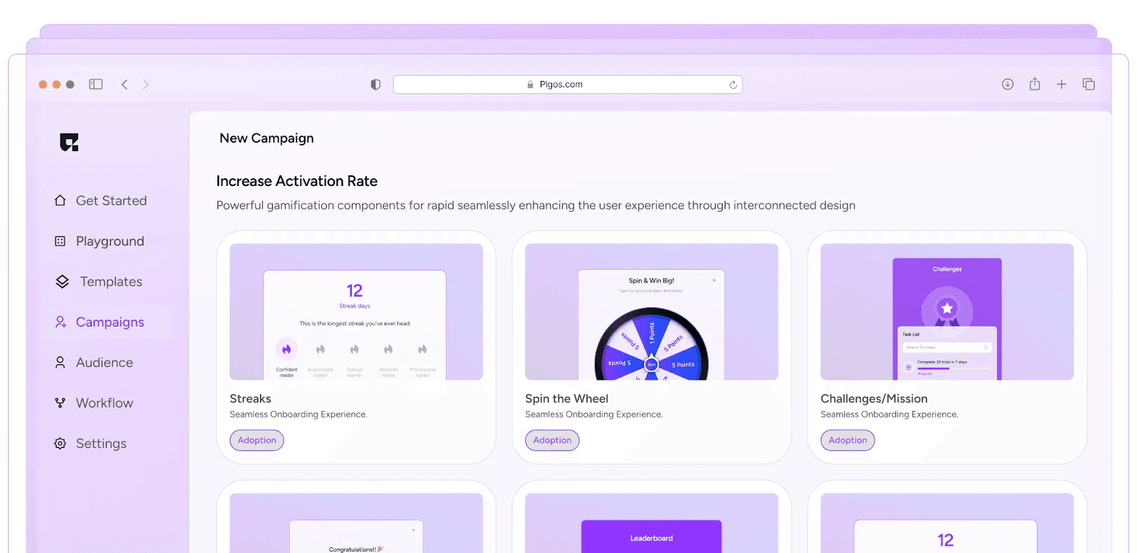
Gamification makes onboarding fun. Gamified screens use progress, points, or challenges to motivate users.
How It Works
- Introduce rewards for completing onboarding steps.
- Include progress bars or achievements.
- Encourage users to complete tasks to unlock features.
Real-Life App Examples
- Duolingo: Awards points and streaks for lesson completion.
- Fitbit: Gamifies goal completion and activity tracking.
Mockup Suggestion
- Step 1: “Complete your profile to earn your first badge.”
- Step 2: “Try your first task and earn 50 points.”
- Step 3: Progress bar showing completion percentage.
PLG OS Advantage
Measure which gamified elements boost engagement. A/B test reward types, progress bar designs, or task difficulty.
7. Minimalist Welcome Screens
Sometimes, simplicity is best. Minimalist onboarding focuses on a clear value proposition and quick action.
How It Works
- IPresent one clean, impactful welcome screen.
- Use a single tagline and CTA.
- Avoid overloading users with multiple slides.
Real-Life App Examples
- Calm: A single tagline and CTA lead users directly into meditation sessions.
- Headspace: Minimalist, calming visuals to create a welcoming environment.
Mockup Suggestion
- Screen: “Relax your mind in just 10 minutes a day.”
- CTA: “Get Started.”
PLG OS Insight
Test different minimal messages for conversion and iterate based on data.
8. Contextual Onboarding
Some app features are complex and only make sense in context. Contextual onboarding delivers help when users need it.
How It Works
- Display hints or tooltips at the moment of first interaction.
- Allow users to skip or revisit tips.
- Avoid overwhelming users with upfront tutorials.
Real-Life App Examples
- Figma: Tooltips appear when users try new tools.
- Spotify: Hints guide users through playlist creation and sharing.
Mockup Suggestion
- Tooltip: “Drag and drop here to add songs to your playlist.”
- Highlight new buttons with a brief animation.
PLG OS Insight
Track which contextual hints are actually used. Optimize placement and timing for maximum impact.
Using PLG OS to Optimize Onboarding
PLG OS is a product-led growth tool that helps teams understand user behavior, test onboarding flows, and improve engagement. Using tools like PLG OS for onboarding analysis can help teams iterate and optimize flows, potentially increasing activation rates by 25–35%. Here’s how you can leverage it:
- Measure Engagement: Track how users interact with onboarding screens.
- A/B Test Flows: Test different screen designs, copy, and CTAs.
- Personalize Experiences: Serve content based on user behavior and preferences.
- Iterate Rapidly: Adjust onboarding flows based on real-time data.
By combining PLG OS analytics with creative design, you can ensure your onboarding screens are both beautiful and effective.
Best Practices for Onboarding Screens
- Highlight value first: Focus on benefits over features.
- Keep it concise: Too many screens overwhelm users.
- Use visuals and micro-interactions: Make content digestible and engaging.
- Test continuously: Use PLG OS to monitor conversion and retention.
- Follow up: Use emails, in-app messages, or notifications to reinforce onboarding.
Conclusion
Onboarding screens are your app’s first impression. They’re not just informational—they’re strategic tools for engagement, retention, and product adoption. From classic feature tours to gamified experiences and contextual onboarding, the right design depends on your users and goals.
Tools like PLG OS give product teams the ability to track, test, and iterate onboarding experiences, turning these screens into a data-driven competitive advantage. By combining creativity with analytics, you can create onboarding screens that are not only visually appealing but also drive meaningful engagement and long-term user loyalty.
FAQs
1. What are onboarding screens in apps?
Onboarding screens are the first set of screens a user sees when opening an app. They guide new users, explain features, and highlight the app’s value to improve engagement and retention.
2. Why are onboarding screens important?
They help users understand your app quickly, reduce confusion, and increase the likelihood of long-term engagement. A smooth onboarding experience can significantly boost retention rates.
3. What are some examples of onboarding screens?
Examples include feature tours, interactive onboarding, progressive hints, gamified experiences, social login screens, minimalist welcome screens, personalized onboarding, and contextual tooltips.
4. How can PLG OS help with onboarding?
PLG OS tracks user interactions, analyzes which onboarding screens perform best, and allows teams to A/B test flows, helping optimize onboarding for better retention and engagement.
5. What are best practices for designing onboarding screens?
Keep them concise, highlight value over features, use visuals and interactivity, test continuously with tools like PLG OS, and consider progressive or contextual guidance to reduce cognitive load.