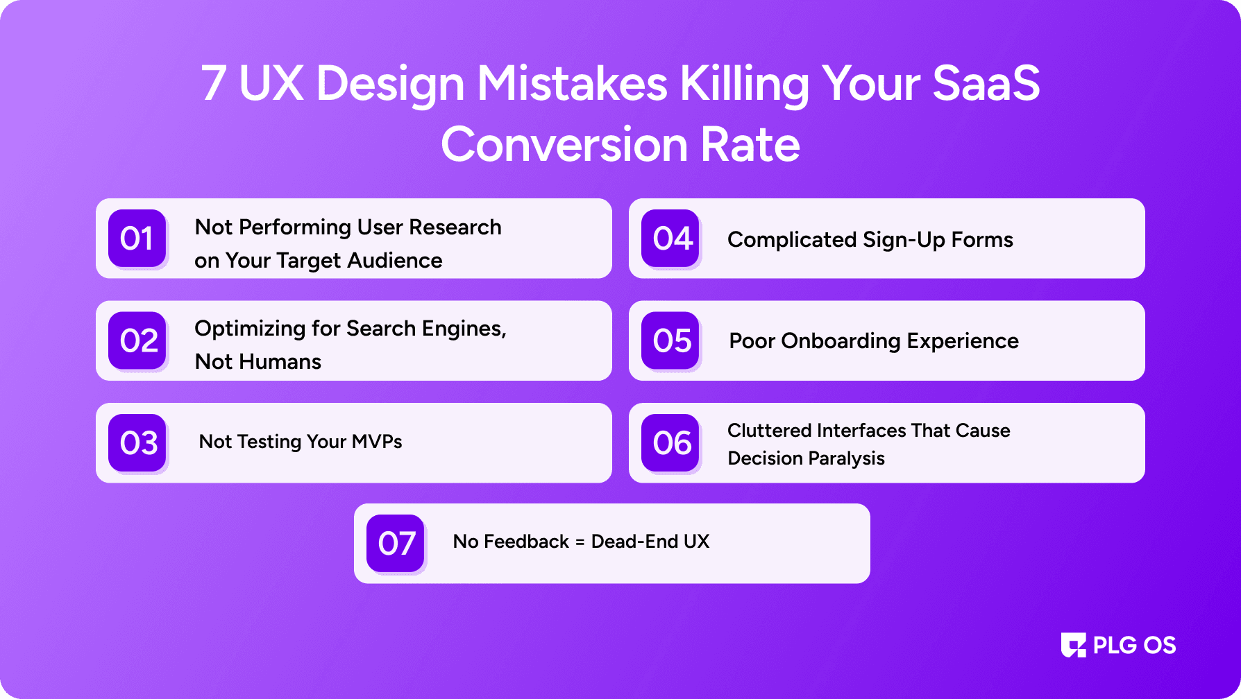
7 UX Design Mistakes Killing Your SaaS Conversion Rate

Ever signed up for a new SaaS tool only to get stuck on the very first screen, unsure of what to do next?
You're not alone, and chances are, your users have felt the same way about your product. In the fast-paced world of SaaS, exceptional user experience isn't a luxury; it's a growth engine. Yet too many companies unknowingly create frustrating roadblocks during onboarding and early interactions, losing users before they ever see the value of the product.
In this blog post, we’ll check out 7 common UX design mistakes that keep users stuck, confused, and ultimately churned. Whether you're designing your MVP or refining your onboarding flow, you'll walk away with practical solutions, real examples, and proven best practices to create a smoother, more intuitive user experience—one that guides users, not frustrates them.
Let’s dive into the UX issues that might be silently holding your product back.
1. Not Performing User Research on Your Target Audience
The Mistake:
Designing based on assumptions or internal biases rather than real user insights.
Why It Happens:
Startups and product teams often move fast. In the rush to build and ship, they skip foundational steps like talking to actual users.
Why It Fails:
- You build features no one needs or understands.
- Language, layout, and flows may not align with the user's mental model.
- You end up solving the wrong problems—or none at all.
Real-World Example:
A SaaS tool built for enterprise users may include complex workflow automations, only to find out their initial user base is made up of solo freelancers.
How to Fix It:
- Conduct early-stage user interviews to understand pain points and behavior.
- Create user personas based on data, not guesswork.
- Use surveys, session replays (like Hotjar or FullStory), and feedback widgets to stay close to user behavior.
- Regularly update personas as your product evolves and scales.
Best Practice Tip:
Run usability tests with at least 5 users per major update. According to the Nielsen Norman Group, that’s enough to uncover 85% of usability problems.
2. Optimizing for Search Engines, Not Humans
The Mistake:
Designing your UX around keywords and SEO hacks, while neglecting user clarity and intent. 74% of users abandon an app after a poor onboarding experience.
Why It Fails:
- Pages are over-optimized and under-humanized.
- CTAs and messaging are unclear or misleading
- SEO tricks disrupt the natural flow of the user experience.
The Fallout:
Users land on your site expecting a clear solution but encounter keyword-stuffed pages with no real guidance. Bounce rates rise. Trust drops.
What to Do Instead:
- Design content and flows based on user intent, not just search terms.
- Keep the copy clean, conversational, and goal-oriented.
- Use headers and CTA buttons that mirror real user language.
- Ensure every click takes users closer to value—not deeper into confusion
Remember:
Good UX and SEO aren’t mutually exclusive. When you satisfy human users, you’re more likely to satisfy search algorithms, too.
3. Not Testing Your MVPs
The Mistake:
Building a Minimum Viable Product (MVP) without any real-world validation or usability testing.
Why It Fails:
- MVPs often rely on internal team assumptions.
- Without testing, you can’t know how users experience your product.
- Small UX bugs in MVPs often compound later on.
Common Signs:
- Users complain about navigation.
- Support tickets spike with "How do I…" questions.
- Key features are underused—or misunderstood entirely.
How to Catch It Early:
- Run quick usability tests with new users before launching updates.
- Use tools like Maze, PlaybookUX, or UserTesting to get remote feedback fast.
- Observe how users move through onboarding flows or feature usage with tools like Hotjar or Smartlook.
Best Practice:
Launch MVPs to small segments with feedback loops built in. Treat them as learning tools, not just go-to-market milestones.
4. Complicated Sign-Up Forms
The Mistake:
Long, clunky forms that demand too much information before showing any value.
Why Users Abandon Them:
- They feel overwhelmed or unsure why the information is needed.
- Mobile users find them especially difficult to navigate.
- Forms don’t communicate progress or offer shortcuts (like Google sign-in).
Research Says:
According to a report by Zuko Analytics, users are 67% more likely to abandon a form that takes over 60 seconds to complete.
What To Do Instead:
- Only ask for essential information up front (email + password is enough to start).
- Break long forms into multi-step processes with a progress bar.
- Enable autofill and provide real-time field validation.
- Offer social logins or one-click sign-ups where possible.
UX Best Practices for Forms:
- Clear labels and placeholder text.
- Visible error messages with helpful explanations.
- Mobile-first design with large tap targets.
5. Poor Onboarding Experience
The Mistake:
Leaving users to figure things out on their own after signup.
Why It Fails:
- Users struggle to grasp the product's functionality and how to initiate use.
- They don’t experience the product’s core value quickly enough.
- They get overwhelmed or lost in a feature-rich UI
Stats That Matter:
According to Userpilot, only 40% of SaaS users complete onboarding. Those who do are more than twice as likely to stick around after 30 days.
Common Pitfalls:
- No welcome message or guidance.
- No tooltips, walkthroughs, or feature highlights.
- No clear next step or success milestone.
How to Improve It:
- Use progress checklists or onboarding flows that guide users to value.
- Personalize onboarding based on role, industry, or use case
- Highlight key features with in-app cues, not just documentation.
- Reward onboarding progress (badges, trial extensions, etc.).
Pro Tip:
Introduce friction only where necessary. Let users explore, but nudge them toward meaningful actions.
6. Cluttered Interfaces That Cause Decision Paralysis
The Mistake:
Overloading the screen with too many options, buttons, and features without a clear hierarchy.
Why It Fails:
- Users don’t know where to look or click.
- Important actions get lost among the noise.
- Users feel overwhelmed and disengage.
UX Psychology Insight:
Hick’s Law suggests that the more choices users have, the longer it takes them to decide, which often leads to no decision at all.
Bad UX Examples:
- Dashboards with more than five competing CTA buttons.
- Navigation bars with 10+ options.
- No visual hierarchy between primary and secondary actions.
Fix It Fast:
- Use visual hierarchy to emphasize the most important tasks.
- Apply progressive disclosure to hide advanced options until needed.
- Focus each screen on a single core action.
Bonus Tip:
Test each interface with first-time users. Ask, “Can they figure out what to do in under 10 seconds?”
7. No Feedback = Dead-End UX
The Mistake:
User actions (like clicking buttons or submitting forms) have no visible or auditory feedback.
Why It Fails:
- Users think nothing happened and may repeat the action or exit the flow.
- It creates confusion and breaks trust in the product.
Examples of Poor Feedback:
- No spinner when submitting a form.
- No confirmation after saving settings.
- No tooltip or hover text to explain disabled buttons.
Fix It with Microinteractions:
- Use animations or checkmarks to confirm successful actions.
- Display real-time feedback for loading, errors, or success.
- Focus each screen on a single core action.
- Include inline messages like “Form submitted successfully” or “Changes saved.”
What to Remember:
Feedback makes the invisible visible. It’s a small change that dramatically improves perceived usability.
How to Catch UX Mistakes Early
Want to stop losing users to these common UX pitfalls? Start with these actions:
1. Conduct Regular UX Audits
- Review screens and flows every quarter.
- Ask: Where are users dropping off? What’s getting ignored?
2. Use Behavior Analytics
- Leverage tools like Mixpanel, Heap, and Amplitude to analyze feature adoption and friction points.
3. Run User Testing (Always)
- Include at least one user testing session per sprint.
- Watch and listen, users will show you what they’re not saying.
4. Interview Your Churned Users
- Understand where the UX failed to deliver value.
- Learn what competitors are doing better.
5. Prioritize UX Fixes in Your Roadmap
- Don’t wait for a redesign. Fix one flaw at a time
Conclusion: Don’t Let UX Be the Growth Bottleneck
Every user interaction is an opportunity to build trust or break it. When users get stuck, frustrated, or confused, they leave. But when your UX design leads them with clarity, simplicity, and purpose, they stay and convert.
These seven UX design mistakes aren’t just theoretical; they’re the exact reasons users churn early or never activate in the first place. Now that you know what to look for, you’re equipped to audit your product, remove friction, and turn user confusion into confidence.
Start small. Fix one mistake this week. Your users and your bottom line will notice.
FAQs
1. What are the biggest UX design pitfalls for SaaS onboarding?
Not doing user research, bad onboarding, cluttered design, and poor feedback systems.
2. How do UX mistakes impact SaaS conversions?
Poor UX causes confusion and drop-off, reducing activation and long-term retention.
3. How can I test my UX without a full team?
Use tools like Hotjar, Maze, and simple user interviews to gather quick insights.
4. Is SEO still important if I focus on UX?
Yes—but optimize for users first. Great UX naturally supports better SEO.
5. How can I fix bad UX on a tight budget?
Start small: clean your forms, simplify flows, and add tooltips—each improves UX fast.