9 Best Autocomplete UX Design Practices to Boost User Experience
If you've ever typed into a search bar and felt time slow as you hunted for the right phrase, you know the value of autocomplete. Done well, autocomplete transforms your search experience from guesswork into guided magic. Done poorly? It can be frustrating, inaccurate, and completely counterproductive. Let’s dive into the 9 best autocomplete UX design suggestions to elevate your autocomplete UX design, autocomplete design, and autocomplete design patterns, and offer autocomplete usability design tips, whether you're building for web or mobile.
What is Autocomplete UX Design?
Autocomplete UX design is the practice of creating user interfaces that predict and display possible inputs in real time as a user types into a search bar, form field, or other input area. Autocomplete is available on 80% of e‑commerce sites, yet just 19% fully implement UX best practices.
It’s used to:
- Speed up data entry
- Reduce typing effort
- Minimize errors
- Help users find relevant results faster
A good autocomplete UX design focuses on clarity, relevance, and responsiveness, showing accurate suggestions quickly without overwhelming the user. Examples include Google Search’s predictive text, e-commerce search bars that show product matches, or form fields that suggest saved addresses.
Benefits of Autocomplete UX Design
Here are the key benefits of autocomplete UX design for SaaS:
1. Faster User Input
Reduces typing time by suggesting relevant options instantly, improving efficiency for tasks like form filling, search, or data entry.
2. Fewer Errors
Helps prevent typos or incorrect entries by guiding users toward valid, system-recognized options.
3. Better Feature Discovery
Suggests relevant functions, settings, or documents that users might not know exist, increasing product adoption.
4. Higher Conversion & Retention
Smooth, intuitive input boosts user satisfaction, reducing frustration and churn.
5. Improved Search Accuracy
Returns relevant results faster, making it easier for users to find exactly what they need.
6. Personalization
Can leverage user history or behavior to display more tailored suggestions, enhancing the overall experience.
9 Autocomplete UX Design Practices
1. Context-Aware Completion
What’s the Deal
Autocomplete that doesn’t account for the user’s context or intent often delivers generic, or worse, irrelevant, predictions. A context-aware system adapts suggestions based on historical behavior, user journey stage, or previous interaction patterns. Boosting UX budget by 10% can lead to an 83% increase in conversions.
Why It Matters
- Enables smarter autosuggest UX design by anticipating what your users really want.
- Enhances autocomplete usability design tips by reducing noise and increasing relevance.
Fresh Insight
Use PLG OS’s analytics and user behavior triggers, like what features users engage with, to inform and prioritize autocomplete suggestions dynamically. For instance, if a user often looks up “analytics,” preemptively serve up related terms like “analytics dashboard” as they type “ana…”.
2. Hierarchical Grouping
What’s the Deal
Flattened suggestions feel chaotic. Hierarchically grouped autocomplete, like separating “Products,” “Categories,” and “Brands”, instantly clarifies what each suggestion refers to.
Why It Matters
- Improves scanability and autocomplete UI patterns for search.
- Helps users filter mentally, making selection faster and more intuitive.
Fresh Insight
Leverage PLG OS to tag user input with categories and render grouped suggestions, e.g., “Products: iPhone 14,” “Categories: iPhone Cases,” “Brands: Apple,” all in real time.
3. Progressive Filtering with Inline Highlighting
What’s the Deal
As the user continues typing, suggestions narrow dynamically and highlight matching segments, like bolding the matching "appl" in "apple watch." Recora reduced support tickets by 142% using session replay to identify UX issues.
Why It Matters
- This autocomplete design pattern reinforces relevance and visually speeds up recognition.
- Maintains clarity between different suggestions.
Fresh Insight
Use PLG OS’s component suite to deliver smart, bolded inline highlights that update as the user types, creating a desktop-like UI even on mobile.
4. Offer Embedded Secondary Actions
What’s the Deal
Sometimes users want quick actions, not just selecting a suggestion but acting on it (e.g., searching directly, filtering results, or going to a category landing page).
Why It Matters
- Enriches autocomplete usability design tips with multi-purpose interactions.
- Empowers power users to streamline journeys.
Fresh Insight
With PLG OS, you can embed quick actions alongside suggestions, like a “Search now” or “Filter by X”, without building extra UI from scratch. Neat, right?
5. Mobile-First, Thumb-Friendly Layout
What’s the Deal
Small screens and big fingers demand designs that are both visually clear and easy to tap.
Why It Matters
- Critical autocomplete mobile design best practices depend on accessible touch targets (minimum ~44px).
- Prevents mis-taps and boosts satisfaction.
Fresh Insight
Deploy PLG OS’s responsive components optimized for touch, leveraging its mobile SDKs (Flutter, React Native, etc.), to deliver autocomplete UX that’s keyboard-and finger-friendly out of the box.
6. Pedantic Position Persistenc
What’s the Deal
When users navigate suggestion lists, via keyboard or touch, the relative vertical position of the highlight should remain consistent. Flickering or jumping destroys flow.
Why It Matters
- Smooth navigation prevents disorientation.
- Bolsters the UX best practices, autocomplete principle of predictability.
Fresh Insight
Use PLG OS so your suggestion list holds a steady position as a user scrolls or uses arrow keys, maintaining a seamless, non-jarring experience. Users select an autocomplete suggestion only 23% of the time when shown—yet they still benefit from reading suggestions.
7. Smart Timeouts & Debouncing
What’s the Deal
Firing search queries on every keystroke can bog down performance or generate poor suggestion relevance due to partial input.
Why It Matters
- Balances speed and precision.
- Supports autocomplete UX design that feels instant without overwhelming backend systems.
Fresh Insight
PLG OS can orchestrate intelligent debounce, hold off for ~200–300ms after typing before querying, and caching previously fetched results to give an illusion of zero latency.
8. Progressive Disclosure for Large Datasets
What’s the Deal
When potential suggestions number in the thousands, dumping them all clogs the UI and user mindspace.
Why It Matters
- A core autocomplete UX design pattern for scalability.
- Avoids cognitive overload by chunking suggestions.
Fresh Insight
Use PLG OS to orchestrate “Show more” triggers or gradual pagination in the suggestion UI, e.g., initial five suggestions, then “Show more,” keeping interfaces lean but powerful.
9. Visible Error Handling and No-Result States
What’s the Deal
What happens if user input returns no matches? A blank dropdown is confusing.
Why It Matters
- Essential for autocomplete usability design tips.
- Keeps the interaction transparent, users understand there’s no match, not a broken feature.
Fresh Insight
PLG OS allows you to inject friendly guidance, like “No results for ‘xyz’, try different keywords?”, or smart fallback actions like spelling corrections or recent searches.
Integrating PLG OS Seamlessly into Your Autocomplete Strategy
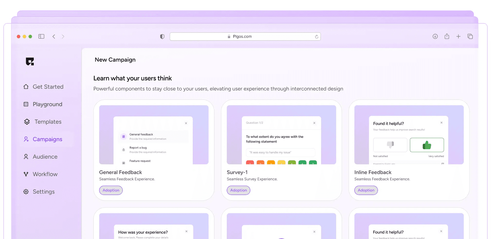
PLG OS isn’t just a buzzword on your list, it’s your powerful ally. Here’s how to apply it smartly:
- Rapid UI Prototyping
Spin up interactive autocomplete UIs using PLG OS native components for web, Flutter, and React, no heavy lifting needed.
- Behavioral Triggers
Tie suggestions to in-app behavior tracked through PLG OS: recent searches, feature interactions, even campaign tags.
- Analytics & A/B Testing
Track which suggestions drive conversions, refine groups, tweak debounce timing, PLG OS handles testing and analytics for you.
- Cross-Platform Consistency
Want unified experience across desktop and mobile? PLG OS makes sure your autocomplete looks, feels, and responds consistently, key in autocomplete UX design
| Pattern | Why It Matters | PLG OS Role |
|---|---|---|
| Context-Aware Completion | Increases relevance | Leverage behavioral data |
| Hierarchical Grouping | Improves clarity | Tag & group suggestions |
| Inline Highlighting | Boosts scanability | Real-time UI updates |
| Embedded Actions | Speeds workflows | Add actionable UI elements |
| Mobile-First Layout | Must for touch UX | Responsive components |
| Position Persistence | Preserves flow | Stable suggestion UI |
| Debounced Queries | Balances speed & quality | Smart debounce |
| Progressive Disclosure | Scales gracefully | “Show more” overlays |
| Error Handling | Avoids confusion | Fallback messaging/UI |
Why Autocomplete UX Design Matters
- Uniquely user-centric: These patterns aren’t boilerplate, they focus on reducing friction at each keystroke.
- Tool-integrated: By featuring PLG OS, you're not just theorizing, you can deploy these patterns fast, with tangible tech.
- Holistic UX design: Bridge across platforms, feedback loops, and behavior tracking for autocomplete UX that adapts and evolves.
- SEO-friendly: With term-rich sections and thoughtful headings, this aligns with search queries like autocomplete design patterns and autocomplete UI patterns for search, making it discoverable and valuable.
Final Thoughts
Autocomplete isn’t just a convenient trick, it has the power to define user perception of your search experience. Pull these nine design patterns into your thinking, roll them out through PLG OS components, and watch as your users glide through search with confidence, speed, and delight.
Want a quick demo or code snippets showing PLG OS in action for any of these patterns? Book a call now!
FAQs
1. How does autocomplete improve SaaS usability?
It speeds up user input, reduces typing effort, and makes navigation more intuitive.
2. Does autocomplete help reduce user errors?
Yes, by suggesting accurate matches, it prevents typos and invalid entries.
3. Can autocomplete boost SaaS engagement?
Absolutely, faster, smoother interactions keep users engaged and reduce drop-offs.
4. How does autocomplete impact onboarding?
It guides new users by showing relevant suggestions, making learning the platform easier.
5. Does autocomplete affect conversion rates?
Yes, by helping users find what they need quickly, it can directly increase conversions.